A Rainbow of Color Choices
At F&R Interiors serving the greater Los Angeles area, we know many of our customers feel overwhelmed by how to add color to their homes. After all, the choices seem endless, and there’s always the question of whether you’ve missed just the right shade of a hue. Sometimes we find the best way to inspire a color choice is to look to the experts in color: the Pantone Color Institute. Each year, they choose a trending color, which comes with complementary hues and lots of emotional resonance. Read on to learn of some of the past Colors of the Year.
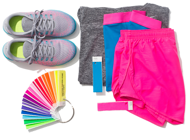
About Pantone and the Color Institute
Pantone established the Pantone Matching System (PMS) in 1963. Most companies use it to get the most exacting match of a color. The system uses numbers to identify each color (for example: Pantone Red 199), making it easy for anyone to refer to a specific color. As Pantone grew, they created the Pantone Color Institute, which is comprised of experts on color and its impacts. Each year, after careful examination of “proof points,” they predict what will be the trending color for the year. Pantone’s color of the year often sets the stage for trends in fashion, window treatments, wall coverings, and interior design. Selecting the Color of the Year takes approximately nine months. “The Pantone Color of the Year has come to mean so much more than ‘what’s trending’ in the world of design; it’s truly a reflection of what’s needed in our world today,” noted Laurie Pressman, Vice President of the Pantone Color Institute.
Inspirational Colors of the Year
In years past, you might have noticed an influx of the following colors in your favorite clothing stores, appliance stores, and even car dealerships: Rose Quartz and Serenity. In 2016, the Color Institute offered up not just one but TWO trending forecasted colors. Rose Quartz and Serenity, known for their calm and peaceful aura, were forecasted to replicate how we would want to feel in the following months. Greenery. Reminiscent of the first day of spring, this yellow-green, snow pea color “is the color of hopefulness and of our connection to nature. It speaks to what we call the ‘re’ words: regenerate, refresh, revitalize, renew.” Ultra Violet. Offering originality, Ultra Violet is provocative and visionary. Long a symbol of unconventionality, Ultra Violet has always been considered a mystical or spiritual color. If one or all of these colors strikes a chord with you, it might work in your home. Speak with one of our consultants to get some tips on how to introduce color to any room.
Color Choices in the Brentwood & Sherman Oaks CA Area
At F&R Interiors, we’ve been serving the Greater Los Angeles since 1990, with a showroom at 1529 S. Robertson Blvd. We offer the full line of Hunter Douglas window treatments including blinds, shades, and shutters. We also have our own workroom, where we can create beautiful custom curtains, top treatments, pillows, and more. Our personalized service, quality products, and professional installation services ensures you’ll find the perfect window treatment solution for your home or business.
We service the Greater Los Angeles area including Brentwood, Santa Monica Sherman Oaks, Beverly Hills, Santa Monica, West Hollywood, Pacific Palisades, Malibu, Hancock Park, Los Feliz, Hollywood Hills, and San Fernando Valley, CA and surrounding areas. Contact us for more details.