Two Great Colors Paired Together
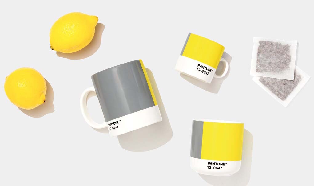
Choosing color can be intimidating, especially if you don’t know what will look good together or what will convey a message you might want represented in your home. Luckily, each year, the Pantone Color Institute alleviates that pressure by announcing a new Color of the Year. At F&R Interiors serving the greater L.A. area, we’re pleased to announce this year’s selection, which is actually two colors instead of just the traditional one: PANTONE 17-5104 Ultimate Gray and PANTONE 13-0647 Illuminating (a bright yellow). Read on to learn more about the process and how you could bring these great colors into your home.
About This Year’s Colors
“The selection of two independent colors highlights how different elements come together to express a message of strength and hopefulness…conveying the idea that it’s not about one color or one person; it’s about more than one,” noted Leatrice Eiseman, executive director of the Pantone Color Institute. The colors are a “marriage of strength and optimism” that combine both warm and cool tones: PANTONE 17-5104 Ultimate Gray evokes a sense of solid and dependable natural elements such as pebbles on a beach. PANTONE 13-0647 Illuminating is bright, cheerful, and vivacious, evoking a sense of the power of the sun.
Understanding Color’s Messages
Color is not a designer’s whim. Color trends come from where we are, where we want to go, and how people are feeling or not feeling. For the past 22 years, the Pantone Color of the Year has inspired manufacturers in industries such as home furnishings, window coverings, industrial design, fashion, and more. Through things like trend forecasts and color psychology, the Pantone Color Institute helps global brands design products that call on the power and emotion of color. Last year’s Color of the Year was Classic Blue, which offers a sense of confidence, connection, and reassurance. This year’s shades offer energy, clarity, and hope to overcome the continuing uncertainty.
Putting These Colors Into Action
The world is your oyster in terms of how you can apply these colors—you use a little or a lot of either or both. Between the two of them, these colors bring a ray of sunshine and a drop of positivity. Bring them to the bedroom through linens, to the dining room through tableware, to the living or family room through wall art, throw pillows, and décor. You can paint walls with one or both of the hues to convey a welcoming message. Or bring them into the home through window fashions or coordinating side panels and drapery. Check out the Design Studio™ from Hunter Douglas for options, including Gray-wood or Storm Grays in Rebecca Atwood’s collection, Saffron in the Transcend collection, or Fresco in the Wilson collection.
Using the Colors of the Year in the Brentwood & Sherman Oaks CA Area
At F&R Interiors, we’ve been serving the Greater Los Angeles since 1990, with a showroom at 1529 S. Robertson Blvd. We offer the full line of Hunter Douglas window treatments including beautiful custom curtains, top treatments, pillows, and more. Our personalized service, quality products, and professional installation services ensures you’ll find the perfect window treatment solution for your home or business.
We service the Greater Los Angeles area including Brentwood, Santa Monica Sherman Oaks, Beverly Hills, Santa Monica, West Hollywood, Pacific Palisades, Malibu, Hancock Park, Los Feliz, Hollywood Hills, and San Fernando Valley, CA and surrounding areas. Contact us for more details.